
Open most Indian skincare brands' Instagram and you'll hit the same three words within a scroll or two: ayurvedic, ancient, ritual. Turmeric passed down through generations, oils pressed the way your grandmother's grandmother pressed them. It's a real tradition and a genuinely oversaturated one, and by 2024 it had become almost impossible to tell one "heritage-inspired" beauty brand from the next. Project Qaafi, launched that year by Aahan Chatterjee, looked at that entire aisle and went the other way.
Not too much, just enough
The name comes from a phrase in Hindustani: "zyaada nahi, bas qaafi," not too much, just enough. It's not a slogan bolted onto the brand after the fact. It's the actual product philosophy. No ten-step routines, no shelf of serums promising to fix everything at once. Chatterjee built Qaafi around the idea that good skincare doesn't need to overwhelm you with options to prove it's serious, which, if you've ever stood in front of a beauty aisle feeling mildly assaulted by choice, is a genuinely relieving pitch.
Qaafi grew out of the same design world as Subko's in-house creative studio, The Craftery, which explains a lot about how the brand looks and thinks. It isn't run like a typical D2C beauty label chasing influencer unboxings. It's run more like a small design house that happens to make skincare.
Rejecting the ancient-oils playbook
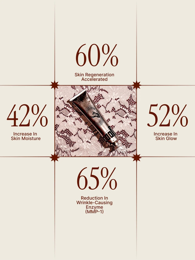
Chatterjee has been fairly direct about not wanting Qaafi to lean on the "ancient secrets" narrative that dominates Indian beauty marketing. That story isn't dishonest, exactly, it's just been told so many times it's stopped meaning anything on a shelf. Instead, Qaafi's formulations read closer to a modern lab than a village apothecary. The flagship hand cream, priced at ₹1,595, is built around Cica exosomes, peptides, and ceramides, ingredients you're more likely to see referenced in a K-beauty or clinical skincare context than in something marketed as distinctly Indian.
That's the quiet provocation of the brand: it's unmistakably Indian in its language and design, and unmistakably modern in its formulation, refusing the assumption that those two things have to pull in opposite directions.
It also means Qaafi is competing in a different lane than most of its domestic peers. A lot of Indian D2C skincare brands still frame their credibility around a founder's grandmother's recipe or a specific regional oil tradition. Qaafi's credibility argument is closer to what you'd hear from a clinical or K-beauty label: named actives, stated concentrations, a formula built to do one job well rather than to evoke a story. Whether that resonates with an Indian buyer used to the heritage pitch is still being tested, but it's a genuinely different bet than almost anyone else in the category is making.
The sword-pin detail nobody asked for
Qaafi's packaging is where the design-studio instinct shows up most clearly, and the small, sword-shaped pin used to pierce the seal on the hand cream tube is the detail people actually talk about. It's not functionally necessary. Plenty of tubes ship with a plain foil seal you just poke through with anything sharp. But Qaafi turned that first-use moment, normally the most forgettable ten seconds of owning a skincare product, into something with a bit of ceremony to it. You unsheath a tiny sword to open your hand cream. It's a strange sentence to write and an oddly satisfying thing to actually do.
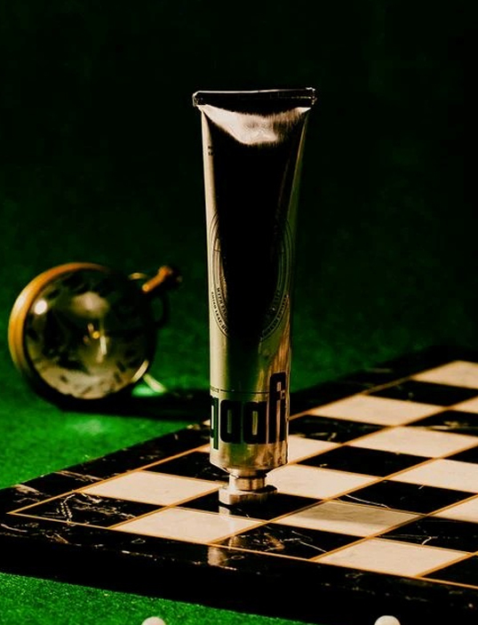
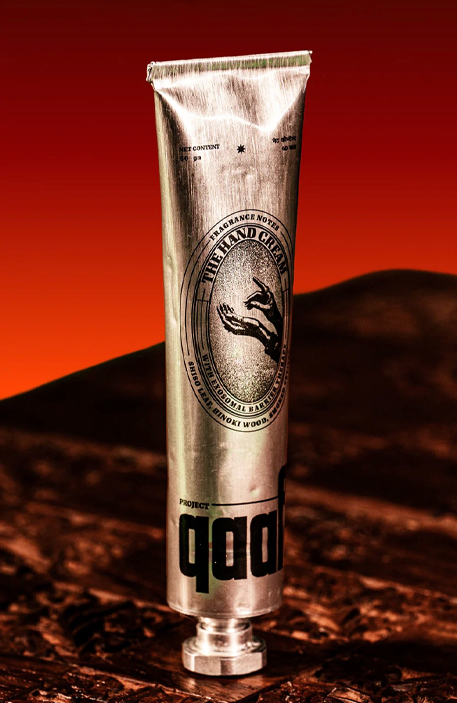
The tubes themselves are industrial aluminium rather than the soft plastic or frosted glass most premium skincare defaults to, paired with bold, geometric typography that reinterprets Indian script forms rather than quoting them directly. Nothing about the shelf presence says "wellness." It reads more like something you'd find in a design museum gift shop, which is precisely the point.
Even the outer packaging carries that thinking through. Qaafi's e-commerce boxes, developed with Go Do Good Studio, are tape-free and flat-packed, built to fold together and apart without adhesive. It's a sustainability choice, but it's presented as a design choice first, which fits the brand's general refusal to lead with a "we care about the planet" pitch.
Building India's answer to Aesop
Chatterjee has talked about wanting to build something like an Indian answer to Aesop, the Australian skincare brand that turned restrained formulation and obsessive packaging design into a global cult following without ever discounting or over-marketing. It's an ambitious comparison for a brand barely a year or two old, but the instinct behind it makes sense. Aesop never won on ingredient lists alone. It won because every physical touchpoint, the bottle, the store shelf, the pump mechanism, felt considered in a way most beauty brands don't bother with. Qaafi is chasing that same standard of physical detail, just built around Indian references instead of Aesop's spare, literary aesthetic.
Whether Qaafi gets there is genuinely an open question this early. But the fact that an Indian skincare brand is being talked about in the same sentence as Aesop, rather than compared to the usual ayurveda-adjacent competitors, says something about how differently it's being read by the design world.
Formulation with a design studio's discipline
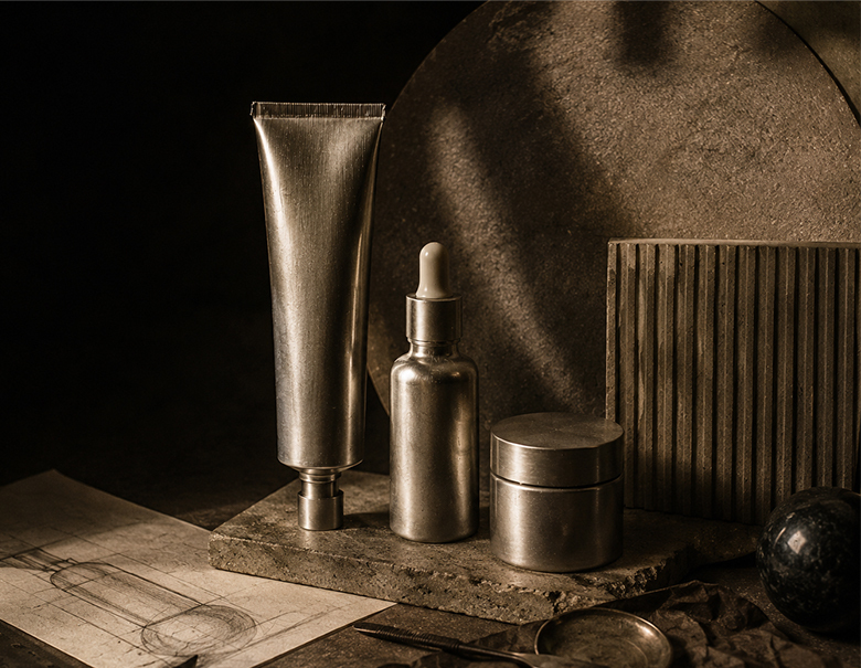
The most interesting thing about Qaafi, beyond the sword pin and the aluminium tubes, is how much the "just enough" philosophy actually shapes the formulas rather than just the marketing copy around them. A design studio's instinct is to strip out anything not earning its place, whether that's a redundant button on an interface or a redundant step in a routine. Qaafi applies that same editing discipline to skincare: fewer products, each doing more, formulated with ingredients chosen for function rather than for how exotic they sound on a label.
That's a harder position to hold than it sounds, especially in a beauty market that mostly rewards brands for launching new SKUs constantly. Qaafi is betting that a smaller, sharper range, treated with real design seriousness, beats a crowded one. Early signs, stocked in design-forward spaces like General Items and Dhora Mumbai rather than typical beauty retail, suggest the bet is landing with the audience it's actually built for.