
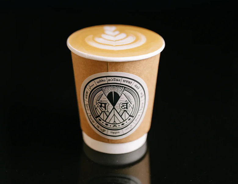
Walk into most specialty coffee shops anywhere in the world and you'll see the same visual language repeated: white walls, sans-serif logo, a bag of beans with maybe a farm name printed in small grey type. It's a look borrowed almost entirely from Scandinavian and American third-wave coffee culture, and Indian roasters had been copying it for years. Then Subko, founded in Mumbai in 2020 by Rahul Reddy and Daniel Valsan Mathew, looked at that template and decided it didn't want any part of it.
A name that does double duty
"Subko" comes from "sabko," Hindustani for "for everyone" or "for all." The founders shifted the spelling to "Subko," swapping in a "u" to nod at "sub," short for subcontinent. Say it out loud and you get both meanings at once: coffee for everyone, coffee from the subcontinent. It's a small piece of wordplay, but it set the tone for everything the brand built after it. This wasn't going to be a coffee company that happened to be based in India. It was going to be a coffee company about being from India, unapologetically.
The pack that puts six scripts on one bag
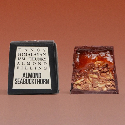
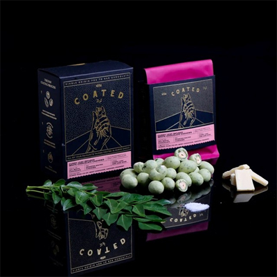
The clearest expression of that idea is the packaging, designed in collaboration with Aniruddh Mehta of Studio BigFat. Most bags carry the brand name in three scripts at once: Latin, Devanagari, and Urdu, sitting layered on top of each other rather than translated into separate, tidy sections. Where there's room, Tamil, Malayalam, and Bengali show up too. It's a deliberate refusal to pick one "Indian" identity and print it. India isn't one language, and Subko's packaging is one of the few consumer products on a shelf anywhere that actually looks like it knows that.
The layered-script idea traces back to old Bollywood film posters, which routinely stacked Hindi, Urdu, and English title cards on top of each other for a single release, because that's genuinely how much of urban India read. Subko borrowed that visual habit and put it on a coffee bag, which sounds like a small move until you realize almost nobody else in Indian specialty coffee had thought to look at Bollywood posters as a design reference instead of Kinfolk magazine.
Rejecting the minimalist café look on purpose
It would have been easier, frankly, for Subko to just do the safe thing: clean type, muted earth tones, a logo that could pass for a Melbourne roastery. That's the aesthetic Indian consumers had been trained to associate with "quality" coffee, mostly because that's what got imported first. Subko's founders bet that Indian drinkers didn't actually need a Western visual vocabulary to trust that the coffee was good, and that a more maximalist, culturally specific design could build just as much credibility, maybe more, because it didn't feel borrowed.
That's a real risk for a young brand. Minimalism photographs well and travels easily across markets; a heavily layered, script-dense design is harder to export and harder to imitate. Subko clearly decided the second part was the point.
Kraft paper, boxes, and the tactile decision
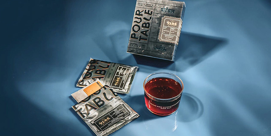
Most specialty coffee in India, like most specialty coffee anywhere, comes in a resealable pouch with a one-way valve, functional and forgettable. Subko instead packages a lot of its coffee in kraft paper boxes, a choice that costs more to produce and ship but changes how the product feels in your hands. A box doesn't behave like a grocery item. It behaves like something you'd give as a gift or keep on a shelf after the coffee's gone. That tactile shift, from disposable bag to object worth holding onto, is doing a lot of quiet work for how people perceive the brand's value.
The boxes also carry more room for storytelling: origin notes, tasting descriptions, and small cultural references specific to where the beans were sourced or roasted. It's the kind of packaging that rewards someone who actually reads the box, rather than one designed to be glanced at from three feet away on a supermarket shelf.
There's a cost to this, and it's not subtle. Boxes take up more shelf space than bags, cost more to print given the layered scripts, and ship less efficiently than a flat pouch. Subko clearly decided that trade-off was worth making in exchange for a product that photographs like a design object and gets kept around after the coffee's gone, which is its own kind of marketing that a resealable bag can't really replicate.
Bean to brew, the specialty coffee movement finally landing in India
None of the design work would matter if the coffee itself wasn't serious, and Subko's rise has tracked alongside a broader shift in Indian coffee culture over the past several years. India has grown coffee, mostly in Karnataka's Coorg and Chikmagalur regions, for generations, but the vast majority of it was historically exported, with domestic drinkers left with instant coffee or filter kaapi made from commodity-grade beans. Specialty roasters like Subko are part of a small but growing group treating Indian-grown beans the way European roasters treat Ethiopian or Colombian ones: sourced with traceability, roasted in small batches, and sold with the same seriousness given to imported beans for years.
That shift matters beyond just flavor. It's the difference between India being a coffee-growing country and India being a coffee-drinking-well country, and Subko has positioned itself squarely as a bridge between the two.
Design as belief system, not decoration
What separates Subko from a lot of brands that lean on "bold Indian design" as a marketing gimmick is that the design choices actually track back to something the founders seem to believe: that Indian identity doesn't need translating or softening to be premium. The multilingual scripts aren't a novelty sticker on an otherwise generic product. They're baked into the logo, the packaging, the whole visual system. Take away the language layering and you'd have a fundamentally different, less interesting brand.
That's rare enough in Indian consumer goods that it's worth naming directly: a lot of "homegrown" brands still design first for an aesthetic imported from elsewhere and add Indian references as garnish. Subko built the Indian reference in as the foundation and let everything else, including the coffee, grow out of it.